
Grungy wallpaper
New Member
💻 Oldtimer
- Joined
- Aug 26, 2002
- Messages
- 1,043
- Best answers
- 0
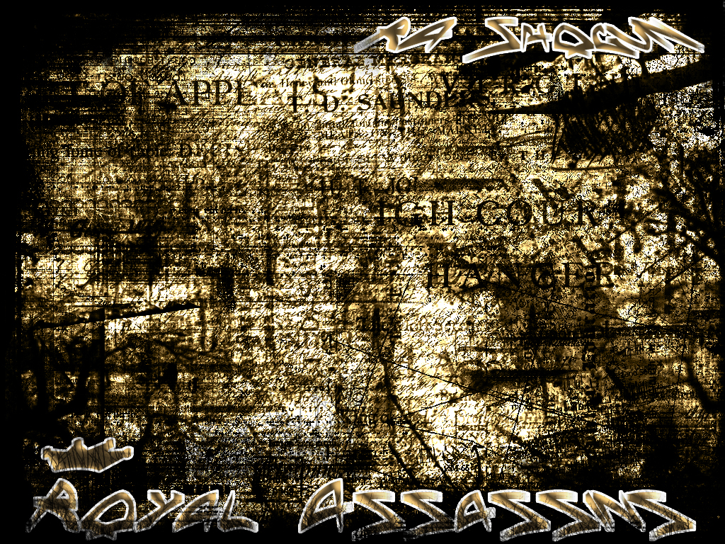
its not so much the actual font but the font technique. its like really glowy so oyu notice it more, I'd sugegst toneing the color down and makeing it more blended.
The wallpaper in a whole isn't GREAT, but its pretty good, keep working with gurnge and oyu'll become more experienced and better.
The wallpaper in a whole isn't GREAT, but its pretty good, keep working with gurnge and oyu'll become more experienced and better.
New Member
- Joined
- Jan 31, 2003
- Messages
- 728
- Best answers
- 0
:O i am newbie at grunge as u can see with my goku grunge thing so i like is 8/10.
almostdeleted
A
Guest
Its nice.. Just the font is just ... well.. Thier.. No blending in and matching with the rest of the bg.. its just thier.. Try and blend it in a bit more..
AND BTW, 3dsm isnt that bad.. it is overused by sometimes it used in different ways.. Look at my sig, it has 3dsm in it, can ya tell?
AND BTW, 3dsm isnt that bad.. it is overused by sometimes it used in different ways.. Look at my sig, it has 3dsm in it, can ya tell?
Ice Cream God
✔️ HL Verified
- Joined
- Dec 2, 2001
- Messages
- 950
- Best answers
- 0
Its nice to see some grunge work in here. I like it a lot. Try taking that white outline out of the text so it dosent stick out so much.
New Member
- Joined
- Nov 24, 2001
- Messages
- 484
- Best answers
- 0
Hmmm...thats a tough one to say...but...i think the font IS a little too bright, other than that, GJ 
New Member
- Joined
- Jan 31, 2003
- Messages
- 728
- Best answers
- 0
I am into grunge lately so make more people bring back grunge
New Member
- Joined
- Jan 15, 2003
- Messages
- 872
- Best answers
- 0
*raises his hand and coughs* I have been doing grunge for like ever, where have you all been!? LOL.
Anyway, props that some of you like it.
On the wallpaper, its a bit too busy. It's an overuse of brush there. The font on the bottom cuts into the image. And only lines scrape the font, try taking chunks out by using a mask, then using a black grunge brush to take out chunks of the font.
It's alright, but for a wallpaper, it would be too busy. Plus it would distract the user a bit too much. So I'd say it's an experiment/indy art image.
New Member
💻 Oldtimer
- Joined
- Dec 24, 2001
- Messages
- 1,660
- Best answers
- 0
I seriously doubt this effect works for anything other then a sig. It looks the same all over most likely it's one texture and that makes it a bit broing, I cant imagine this as a background I would get dizzy everytime I see it, allthough the effects is nice, it would work better for some smaller indy art splash or a sig imjo
New Member
- Joined
- Jan 15, 2003
- Messages
- 872
- Best answers
- 0
Like the parts of text that are scratched..make them even more scratched by masking parts of them.
New Member
💻 Oldtimer
- Joined
- Mar 16, 2003
- Messages
- 1,162
- Best answers
- 0
ooooooooo I see... So ill remove the outline, and change the contrast... peoplea re saying its to bright so Ill listen to that... and I needa scratch up the text a lot more kk
I think ill just take out the text all together >.<
Im not going to call them a "Wallpaper" anymore... so here >.<
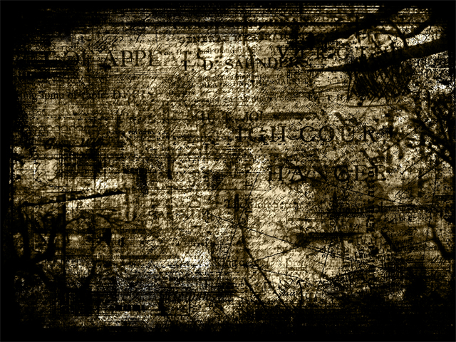
Hope that looks better without the font... and now that its not so bright
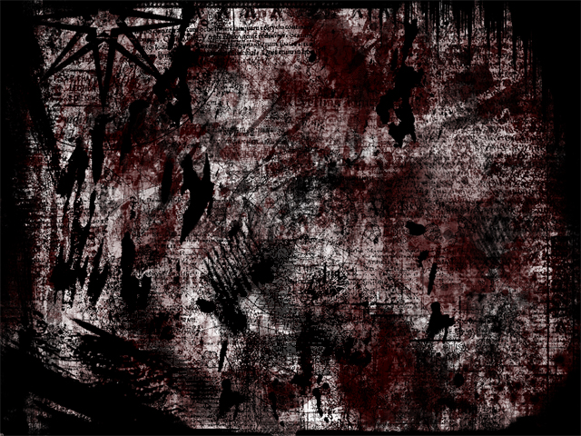
Thats a new one... hope its a little better.... Im not good with fonts... so ill leave them out
so Ill listen to that... and I needa scratch up the text a lot more kkI think ill just take out the text all together >.<
Im not going to call them a "Wallpaper" anymore... so here >.<
Hope that looks better without the font... and now that its not so bright
Thats a new one... hope its a little better.... Im not good with fonts... so ill leave them out
New Member
- Joined
- Jan 15, 2003
- Messages
- 872
- Best answers
- 0
Nice, but still, nothing totally fancy No real subject so it kinda goes into a experimentation category eh?
No real subject so it kinda goes into a experimentation category eh? Users who are viewing this thread
Total: 1 (members: 0, guests: 1)
Share: