
Lost in space
💻 Oldtimer
I think it's still too early for crits. Send us some updates and U'll get crits.
")
New Member
💻 Oldtimer
Looks good, can't wait to see it when it's done xD
New Member
- Joined
- Feb 23, 2006
- Messages
- 515
- Best answers
- 0
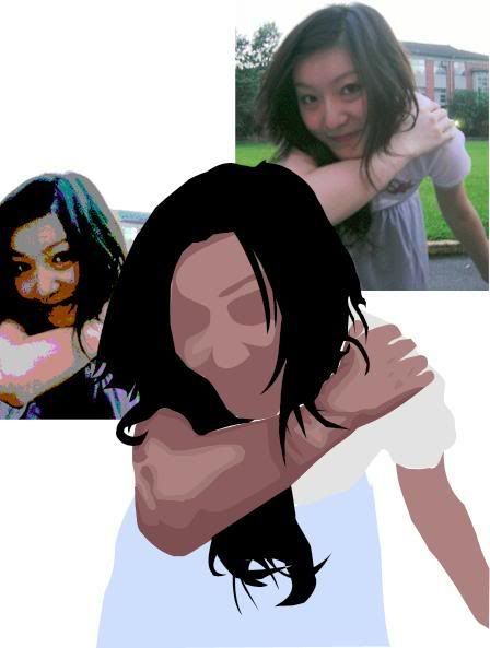
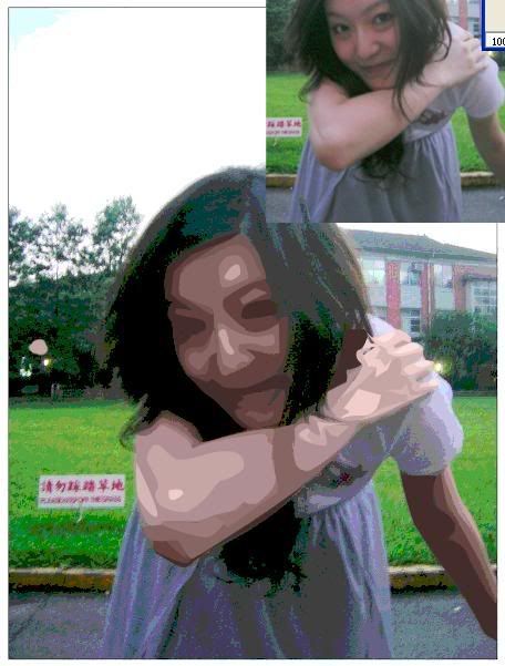
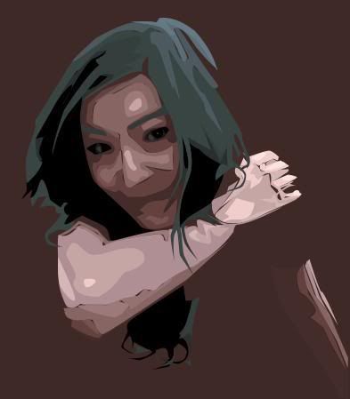
Be less harsh on the skintones.. The hard transitions kinda destroy it for me.
Yeah i must say, the skintone is much too contrasted, make it a bit more subtle. I'd also reconsider the amount of detail on the hand, from the picture it's almost flat, the detail you've included doesnt look simple enough.
Active Member
💻 Oldtimer
- Joined
- Nov 6, 2005
- Messages
- 1,037
- Best answers
- 0
IMO you try to match the picture too much. You try to match every shade of colour that's in the pic. (at least it looks like it)
I'd try to use 3 shades max (normal colour, highlight and shadow), that way it would look much cleaner.
Some parts also seem traced too jaggy (like the hair that falls on the arm).
Altogether I'd try to not trace the really tiny bits. Trace only parts/colours that have a certain size, and ignore smaller bits.
Users who are viewing this thread
Total: 1 (members: 0, guests: 1)
Share: