Posted by nuttzy - Yesterday at 09:34 PM
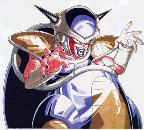
cuz those lines arent that great, they are way too dark, which makes them stand out too much,
they aint evenly spaced out either, makes it look really sloppy,
(updated it alot now , looks fine on the uvwmap prolly some stretching going on I suppose)
the yellow padded sections of the armor need some work as well, on the shins they arent centered on the leg as they should be, and on the forearm they are too narrow, on the stomach it is insanely large,
( I'll get to them soon)
the skintones for the legs+feet, arms+hands are different balance that out,
(legs + arms are same tone like show) (hands + feet are a different tone just like the neck skin check the refs
") )
)also as noted by other people, the shoulder+chest armor is wrong as well,
( I already said the shoulder armour wasn't accurate)
that face is actually pretty good, prolem is, the rest of it doesnt match up,
( thanks! lol I still hate it )
(you did ask for crits, here they are)
Thanks for the critz nuttz! I ain't really a practising skinner but I try lol :talk: