New Member
💻 Oldtimer
- Joined
- Oct 3, 2004
- Messages
- 1,462
- Best answers
- 0
First let me say...
I love how 1.3 is taking shape...
but would like to make a couple of suggestions that might make it even better looking.
1) If the team wants to stay as close to the manga as possible, I recommend less blending of light and more solid color outlines etc...
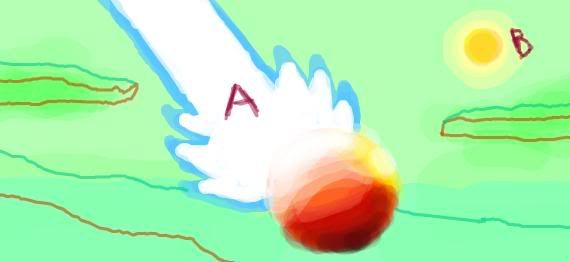
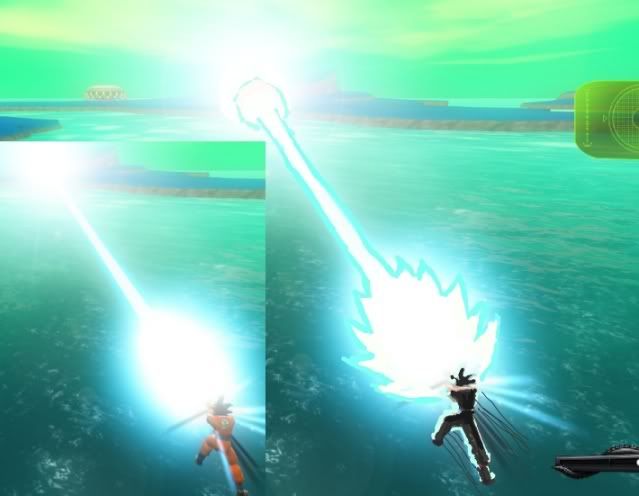
2) More contrast. In the picture below, Goku's KHH is emitting a LOT of light, and that light is concentrated in front of Goku, so Goku's back and front should be almost opposite colors (black and white).
I've provided an example of what I am talking about.
And for the contrast... the main light source is concentrated on one side, therefore the other side of this guy looks black

Thanks for listening.
I love how 1.3 is taking shape...
but would like to make a couple of suggestions that might make it even better looking.
1) If the team wants to stay as close to the manga as possible, I recommend less blending of light and more solid color outlines etc...
2) More contrast. In the picture below, Goku's KHH is emitting a LOT of light, and that light is concentrated in front of Goku, so Goku's back and front should be almost opposite colors (black and white).
I've provided an example of what I am talking about.
And for the contrast... the main light source is concentrated on one side, therefore the other side of this guy looks black
Thanks for listening.