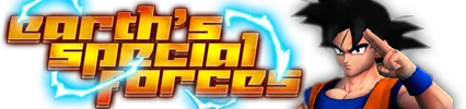
Love the blending on the first one, the way the far right pic pops out. The text, however, is murdered by the outer glow. A simpler text, perhaps even a handwritten kind of font would fit more.
Alucard is blended in way to much on the second one, though. The arm with the black pistol looks weird. Too dark and grungy, as well. The text pretty much fits, though.
8/10 and 7/10