
New Member
- Joined
- May 18, 2004
- Messages
- 520
- Best answers
- 0
I bother XD
The coca cola girl is very sexy looking, its overall a great picture. To improve it you could try adding some strong specular highlights to her very plastic looking outfit, that should really lift her off the pag..screen")
The coca cola girl is very sexy looking, its overall a great picture. To improve it you could try adding some strong specular highlights to her very plastic looking outfit, that should really lift her off the pag..screen
Super Moderator
💻 Oldtimer
- Joined
- Dec 1, 2001
- Messages
- 3,125
- Best answers
- 0
omg Linda it is you! \o/
Excellent drawings, but it's to be expected. Nice free plug for Coke though =P.
Excellent drawings, but it's to be expected. Nice free plug for Coke though =P.
It's amazing what a little PR can do to a product that was originally opium based and is currently the sweetened face of an enormous evil beverage empire.
But that is neither here nor there. Conceptually it's tied together much better than all of your other work. It also has a very consistent quality that I like. I think if you experiment with that style a little more you can make it very striking. This whole vector art thing that is falling into trend these days is, I would bet, going to create a backlash to that sterile form of art and I think people who can create very rough, organic, and concise imagery are going to be a premium. So work with it, I suspect it may be very valuable to you in the future. Try finding simple brush strokes that create certain textures. Just like a gesture, nothing more.
As an advertisement it's not bad. I think it would work better in the world market than it would here. I also think that the point of diversity that your teacher made is a good one. Even if the Coca-Cola company wasn't trying to con the world into believing that they package dreams in a bottle (for example, how does a drink with no nutritional value that has half the carbs "set you free?"), maintaining an element of cultural diversity is important. It's one of those things that people don't notice unless it's not there. I think a lot of minorities just gloss over the ads that are only for the clean-cut white folk. I know I do. Or at the very least it is a barrier to generating interest.
Busy Busy Busy
★ Black Lounger ★
💻 Oldtimer
- Joined
- Nov 24, 2001
- Messages
- 1,439
- Best answers
- 0
All crits aside, that's an awesome piece. Especially for not using a refrence. What type of paint do you use?
It looks like the hand holding the bottlecap has been dislocated from the forearm. There is a sharp angle from the outside of the hand to the forearm.
It looks like the hand holding the bottlecap has been dislocated from the forearm. There is a sharp angle from the outside of the hand to the forearm.


New Member
- Joined
- Mar 10, 2004
- Messages
- 121
- Best answers
- 0
hey lovers, havent posted in ages, i just needa know wat u guys think of this....... angela said the bg was too orangy red. what do u guys think?
any other crits are good too since i just started blocking in the colors for this picture.

any other crits are good too since i just started blocking in the colors for this picture.

New Member
- Joined
- Mar 10, 2004
- Messages
- 121
- Best answers
- 0
just for comparison.
version 1
version 2
version 1
Linda said:hey lovers, havent posted in ages, i just needa know wat u guys think of this....... angela said the bg was too orangy red. what do u guys think?
any other crits are good too since i just started blocking in the colors for this picture.
version 2
Tales said:guysss let's stay on topic!! is it too orange or..???
here's the other version
is this version better, or linda;s earlier version better?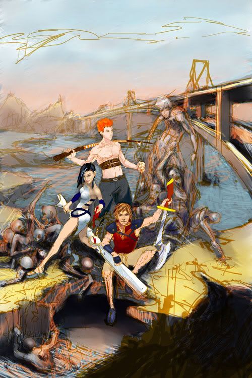
thx
:'( beautiful... just beautiful... man i shud so draw more... i hate you!
I think version one has the nicer colours, but version 2 is much cleaner.. if u combined the two it'd be perfect.
I really like the brushwork in the snake one and the girl above him....
You've just made my list of talent that must be "disposed" of >;[
I think version one has the nicer colours, but version 2 is much cleaner.. if u combined the two it'd be perfect.
I really like the brushwork in the snake one and the girl above him....
You've just made my list of talent that must be "disposed" of >;[
New Member
- Joined
- Apr 10, 2005
- Messages
- 104
- Best answers
- 0
But Version 1 is shaded better. Version 2 may be cleaner, but I think it looks bad because of it. Look at that broad's leg on the left for a good example (and the dude in the middle). Also look at the face of the man with orange hair. In the first version, it looks like he's serious, but in the second version he appears to be expressionless/stoned.
I'd go with version one, but tone down the orange a touch to where it looks like a serious sunset rather than a happy-go-lucky one (unless that's what you want. in that case good job.)
But if you want my real expert analysis, stick with the DMZ forums for art critiques. There's a reason you forgot about this place......
New Member
- Joined
- Mar 10, 2004
- Messages
- 121
- Best answers
- 0
hmm.. i wasnt really talking about how well each picture is shaded, just wanted color advice, (cuz version 2 was my first draft, then i changed the colors to orange and worked off of that for version 1 thats why its better shaded) but i think i found my answer to take the orange down a bit. thanx everyone!
and sorry for the crappy quality, had to take the .jpegs down to save space on my server.
and wow half-unit... who are u from DMZ? i think you nailed the reason why i disappeared....
any other critiques are welcomes. thanx everyone, i appreciate it. once i gather up all the comments ill start reworking it tonite.
and sorry for the crappy quality, had to take the .jpegs down to save space on my server.
and wow half-unit... who are u from DMZ? i think you nailed the reason why i disappeared....
any other critiques are welcomes. thanx everyone, i appreciate it.
once i gather up all the comments ill start reworking it tonite.I was trying to say, that the colours look cleaner on the second version, the first one is very orange all over... in a kinda muddy murky way (not bad though, i still prefer the colours) the second one has more clean vibrant colours.
and yeah, the community here isnt that great for critiques outside of the modeling section =/
and yeah, the community here isnt that great for critiques outside of the modeling section =/
New Member
- Joined
- Apr 10, 2005
- Messages
- 104
- Best answers
- 0
Oh, well that explains that. In that case, I'd still go with the orange. The blue seems overly bleak to me, like some futuristic wasteland (well, they both look like a wasteland of some sort, but the blue seems bleaker). But it seems you've already made your choice so whatever I say is somewhat moot at this point.
By the by, my DMZ name is ......... super secret. Shhhhhh... No but really, I'm still an active member. Take a guess if you'd like.
By the by, my DMZ name is ......... super secret. Shhhhhh... No but really, I'm still an active member. Take a guess if you'd like.
New Member
- Joined
- Mar 10, 2004
- Messages
- 121
- Best answers
- 0
hmmm.... who on dmz uses proper grammar and capitalizes every sentence and uses commas? sure as hell cant be glenn danzig.
TIS TIEHN!
here are things my teacher advised me to do another comments i gathered from esf/dmz..... at this rate hopefully i can finish the entire thing by friday and do mini touch ups. after tonite im just fixing placement and color... tomorrow ill do details.
1. tone down the orange water (desaturate it a bit)
2. crop the sky
3. add to the bottom of the picture after cropping
4. enlarge the three characters u see
5. then make the sitting guy even bigger.
6. make the bridge look less like the sanfrancisco bridge.
7. grey the skull justttt a tad bit.
hopefully thatll fix most of the problems...... otherwise ill go for another round of crit gathering.
Users who are viewing this thread
Total: 1 (members: 0, guests: 1)
Share: