New Member
- Joined
- Oct 23, 2004
- Messages
- 302
- Best answers
- 0
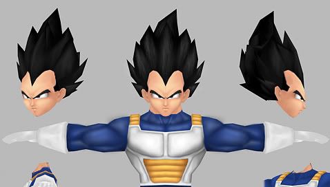
Raven Blade said:WELL, I was working on it while not checking the thread.......*slappehz myself* but my real problem area was the legs, I really wasent fond of how the looked. Anyway I'm quite happy with them now, and with a few adjustments to follow davidskiwan's drawover they will be pretty pewfect.
*cough* bordem = INVERT ZE BLACK...HUE!!!!!!!!!!!!!!!!!! *cough*

I'll fix and post a proper render later ^_^;
Teh sweetness, make an extra version lik ethat.
") gj! Even i would like too see abit damaged armor too... that what lord killmore done ^^ but its your way! GREAT JOBY!
gj! Even i would like too see abit damaged armor too... that what lord killmore done ^^ but its your way! GREAT JOBY!