New Member
- Joined
- Mar 13, 2003
- Messages
- 952
- Best answers
- 0
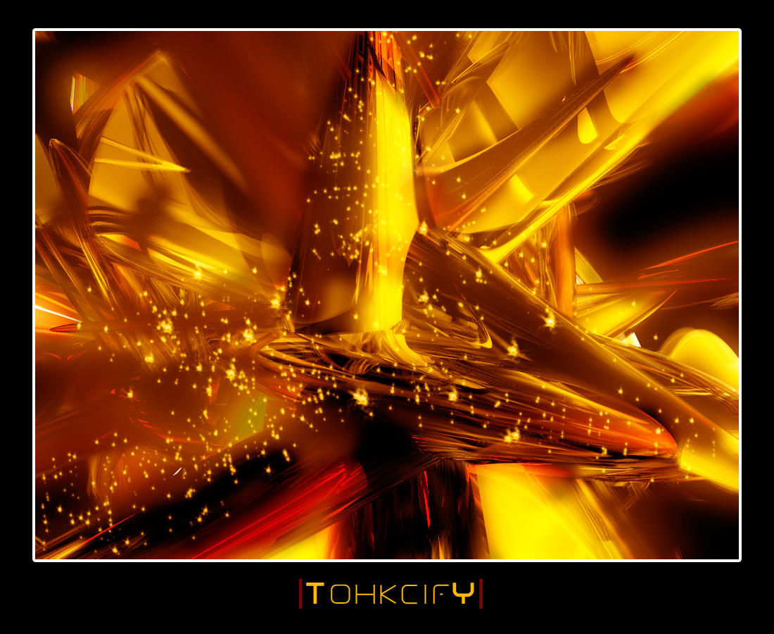
I really like this one.. don't know why. I know the stars aren't that great.. I'm thinking about getting rid of them. What do you guys think about it?

I like it aswell, but what Naz said, the font is a bit too big.
yep, try working on these pointsNaz said:either way it's "ok". The problem you have with the stars is that they dont fir the 3d.. a simplistic reason for that would be that you didn't try to create depth with it. Making the 2d contrast with the 3d.. Anyway, like judge said I would say, the font is too big, also there are white spots in there wich don't seem to serve a purpose. Last but not least, try to make the 3d part look a part from the texture so that the bg isn't just one big texture but instead some nice 3d object to look at :]
Naz said:intresting o_o
you must have the abillity to look in the future judge ;-)
either way it's "ok". The problem you have with the stars is that they dont fir the 3d.. a simplistic reason for that would be that you didn't try to create depth with it. Making the 2d contrast with the 3d.. Anyway, like judge said I would say, the font is too big, also there are white spots in there wich don't seem to serve a purpose. Last but not least, try to make the 3d part look a part from the textureso that the bg isn't just one big texture but instead some nice 3d object to look at :]
good luck,
grtz naz
 , I was probably a sleep when I typed that before. hmm my bad