


New Member
- Joined
- Oct 26, 2003
- Messages
- 84
- Best answers
- 0
Mm....i like them both... i just love the stock on the second and the bg's are looking good
You must be basing that opinion on the font used in the second sig...Saiga said:It's Dask's old style all over again.
As far as my critz...
1. The bg is cool, but the color isn't. Also the image looks realy low quality, but that could be a photoshop mistake. 5/10
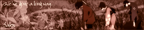
2. I don't like the BG, and the image is a really bad interpretation of Sakura. I cringed when her face morphed into that. 4/10
Lost in space
💻 Oldtimer
- Joined
- Mar 21, 2002
- Messages
- 1,887
- Best answers
- 0
so apparently ryoko has several accounts and posts many sigs with each account
i sorta agree on the second one, the first one isnt really like anyones, imo. Dask's old style is a lil different than that.Saiga said:I based it on the fact that the sigs have a 'watered-down' colour, IE: weak. The 'foggy' top brush layer, the font and font placement, also the non-blended stock. It just looks like Dask's old style.
The first one i dont really like
 there are some areas where it is sharp contrast between light and dark but they are misplaced and lack composition, and it doesnt fit with the way u blended the image, its not far off from being nice though, i think you need to add a bit of variation in the background with subtle brushes, i'd suggest using the colour of the guys hair in the stock u used (the highlighted part not the dark) and use the brush on a few different blending options, im not sure but thats what i'd do. i'd give it a 5.5/10 atm not bad but i think there is needless highlights in the background and other reasons ive stated.
The second i like a lot >< i think its good and i think the stock is perfect, i'd just make the light coloured brushing a bit brighter, not much but eh its just a personal taste really. if u made the dark colours a tad bit darker it would add sum depth into it as well. I'd give it 8/10
sorry just feel in a really artsy mood.... meh likes closely looking at artwork and deciding what i do and dont like :fight:
Lid
L
Guest
I was coming here to say this.GhostfaceKillah said:so apparently ryoko has several accounts and posts many sigs with each account
This is just a stage of my learning evolution, I know they may look like Ryoko's or Dask's sigs I use a simlilar style because i like how it looks, I believe this will change eventually once i keep going onGuru_San said:So Sakuma... are you ryoko? or did you just beat ryoko up and steal all her sigs and... eh change the name ¬_¬''
-SaN
Anyways new secondary sigger ^.^

C&C
owa said:No Sakuma is a lady. Everyone ask for naked pictures, it is what you wanna do.
And now representing human stupidity in all its glory.owa said:But you are a HAWTTIE GIRL, OHHHH BABY!!!!!1111!!!!!!11!
At least you diddnt go all that off topic v.v'owa said:Nice sigs, good font picks. Kind of boring though...
Usually i use my own screens but these are from naruto-kun.comGuru_San said:hmm i like it! lol where do you get all the good quality images from??
Well a new one i fixed up, now Ryoko go tell me its crowded >_> cuz it is, I know <_<

C&C
New Member
- Joined
- May 12, 2004
- Messages
- 173
- Best answers
- 0
they are so darn sexy
New Member
- Joined
- May 12, 2004
- Messages
- 173
- Best answers
- 0
ur one is awesome too sorrow. Where is gaara these days, he wouldnt answer my pms.
I dont think you noticed gaara had a name change xDSPIDER-BITE said:ur one is awesome too sorrow. Where is gaara these days, he wouldnt answer my pms.
Anyways new sigzor, with champlooness =O
Users who are viewing this thread
Total: 1 (members: 0, guests: 1)
Share: