
New Member
✔️ HL Verified
💻 Oldtimer
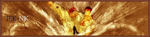
like hwoarang says, it has a bit to much brushes around Ryu itself, but overall it looks very nice, dont find font matching to good tho...
8/10
(because i like such brush works , i still wonder where ppl get those brushes...i wanna make sigs like that too >.< I NEED GOOD BRUSHES!!!)
8/10
(because i like such brush works
, i still wonder where ppl get those brushes...i wanna make sigs like that too >.< I NEED GOOD BRUSHES!!!)New Member
💻 Oldtimer
- Joined
- Jun 14, 2003
- Messages
- 1,397
- Best answers
- 0
Well bro.. hate to disapoint you but that's not custom brushes that's all stock photoshop brushes..Sicron said:like hwoarang says, it has a bit to much brushes around Ryu itself, but overall it looks very nice, dont find font matching to good tho...
8/10
(because i like such brush works
New Member
✔️ HL Verified
💻 Oldtimer
o.o it is? wow....i really need to learn some mroe brush effects....
New Member
- Joined
- Aug 23, 2004
- Messages
- 70
- Best answers
- 0
Its very nice signature but ryu as you know is hard to see, Text isnt all that great either, Might want to fix that. Maybe make the text the same color theme as the rest of the sig, might work. Add stroke to the text and it might look better, Not sure though.
Users who are viewing this thread
Total: 1 (members: 0, guests: 1)
Share: