
Member
✔️ HL Verified
🚂 Steam Linked
Discord Member
- Joined
- Sep 19, 2005
- Messages
- 590
- Best answers
- 0
remove the text and its pro..

Member
✔️ HL Verified
🚂 Steam Linked
Discord Member
- Joined
- Sep 19, 2005
- Messages
- 590
- Best answers
- 0
try giving another edit to it, so you can fill it :/
Member
✔️ HL Verified
🚂 Steam Linked
Discord Member
- Joined
- Sep 19, 2005
- Messages
- 590
- Best answers
- 0
Lol, the best you can do :/
ppl got different thoughts
ppl got different thoughts
Active Member
💻 Oldtimer
- Joined
- Nov 6, 2005
- Messages
- 1,037
- Best answers
- 0
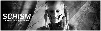
Without text is better.
But you should do something with that text bg (don't know how to call that black semi-opaque stripe). Either make it more visible to the right (so it continues through the sig) or remove it.
/2 cents
But you should do something with that text bg (don't know how to call that black semi-opaque stripe). Either make it more visible to the right (so it continues through the sig) or remove it.
/2 cents
Active Member
💻 Oldtimer
- Joined
- Nov 6, 2005
- Messages
- 1,037
- Best answers
- 0
Yea that's what I meant^^Oh, you mean the bar the text used to be on?
Because now it's a bit unbalanced, the left side is darker and has that bar. Well just try out what it'll look like.

Users who are viewing this thread
Total: 1 (members: 0, guests: 1)
Share: