[Old PotW] High Setting vs Low Setting

Only go forward sideways
✔️ HL Verified
🚂 Steam Linked
🎈 Advanced
Joined
Apr 24, 2010
Messages
482
Best answers
0
Location
UK
Could swear this game looked better when they first released that Cell Shading stuff....What happened to those nice outlines? It had more of a Budokai look
 
Dudemeister
★ Black Lounger ★
✔️ HL Verified
🚂 Steam Linked
💻 Oldtimer
Joined
Jan 16, 2007
Messages
1,672
Best answers
0
Trunk's jacket has too many folds, especially considering that it's supposed to be a jeans jacket.
 
Everyone's Favorite Weirdo :D
🌠 Staff
✔️ HL Verified
💻 Oldtimer
Joined
Dec 31, 2001
Messages
1,423
Best answers
0
Could swear this game looked better when they first released that Cell Shading stuff....What happened to those nice outlines? It had more of a Budokai look
We turn them off, there is an option for you guys to turn it on and off. We just like it more w/o the lines so we can really see the detail in our models / textures. Plus it gives a different type of feel, so not to worry, you can always turn them on in your copy when you wish :)
 
New Member
✔️ HL Verified
Joined
Jul 5, 2006
Messages
469
Best answers
0
Where's the ultra setting :eek:

nvm just joking ^^
Looks nice indeed.
Idk why but i kinda like the more dark look of the sky in the low quality side.
Also how are the other models? You guys mostly pic trunks so i'm wondering if there's a reason for it.
 
Everyone's Favorite Weirdo :D
🌠 Staff
✔️ HL Verified
💻 Oldtimer
Joined
Dec 31, 2001
Messages
1,423
Best answers
0
I don't take the pics but I believe its because trunks is housing all of the new animations I'm doing for the final release. I'll start copying the animations to the other characters ad soon as my animation library is finalized
 
And then there were none.
✔️ HL Verified
🚂 Steam Linked
Discord Member
Joined
May 5, 2011
Messages
55
Best answers
0
Location
Meridian Idaho...or is it?
The art for the new hud...I don't know...looks kinda cartoonish. It's not a bad thing, but I'm not really
hooked on it.
 
Stalwart Assassin
✔️ HL Verified
🌟 Senior Member
Joined
Mar 30, 2003
Messages
162
Best answers
0
Location
New York, USA
I will obviously be using the high setting, but it is nice to see that there will be a solid low setting for those that can't run the game on best quality.

The HUD looks nice and is very well designed (everything has a scouter-esque look), but it is just a little too plain so far. If it were possible to add Shenron to it, or make some of the edges pointed like the shape of an aura, I think it would look better. It is very well made and I like the color scheme, those are just two suggestions to maybe jazz it up a little.

Lastly, the song sounds great! As always, keep up the amazing work! :yes:
 
Data Technician
✔️ HL Verified
Discord Member
Joined
Apr 14, 2008
Messages
246
Best answers
0
Location
Denmark
See this thread..

Think about the thread..

Worship the thread..
Thank the Gods for those people behind the thread^^

You guys are awesome :D
 
Wannabe Beta Tester
✔️ HL Verified
Joined
Aug 29, 2010
Messages
174
Best answers
0
Not a huge fan of the new HUD design, great work as it looks good, just not for ESF.
 
Force Pit Member
Joined
Dec 1, 2002
Messages
874
Best answers
0
Location
Gothenburg, Sweden
Not a huge fan of the new HUD design, great work as it looks good, just not for ESF.
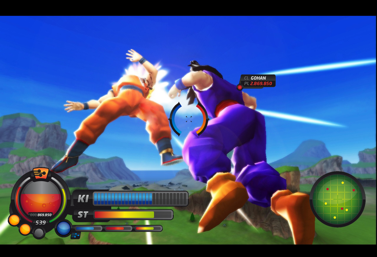
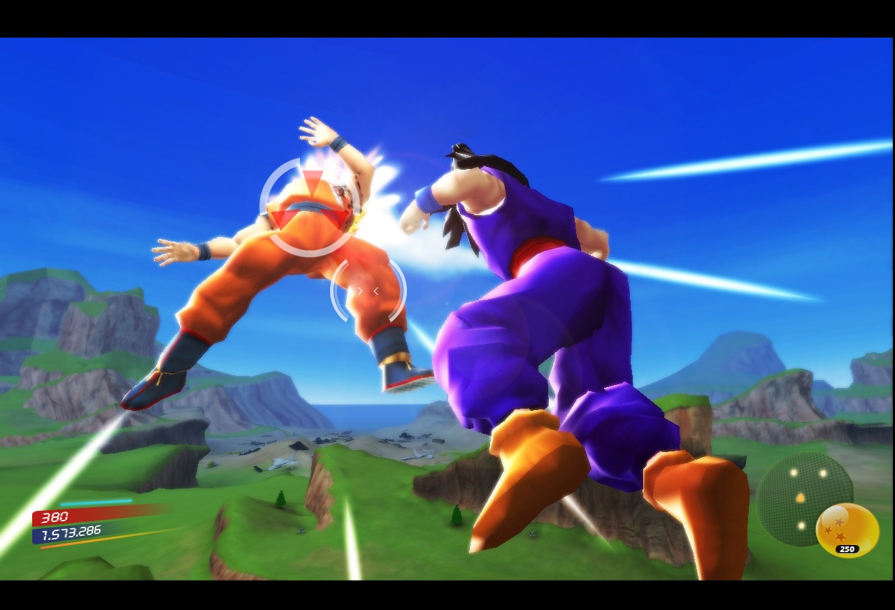
Evidently, HUD design is very subjective. Some people are very minimalistic and some like to blow things up so that they see every icon. Some want the realistic look and others the more cartoony. It's great that the game will several different HUD designs so that you can choose the one you are most comfortable with.

I like it however!
 
2D god
★ Black Lounger ★
✔️ HL Verified
Joined
Dec 3, 2004
Messages
284
Best answers
0
Raven why don't you show the public my HUD design and see what they feel about it... especially since they don't like this one
 
Judge. Jury. Executioner
👮 Moderator
★ Black Lounger ★
✔️ HL Verified
💻 Oldtimer
Joined
Aug 26, 2010
Messages
2,241
Best answers
1
Location
San Francisco
We do like this one. Its just some people think it could do with a few more tweaks. Although we wouldn't mind seeing more variations from different people.

I'll be happy with whatever we have.
 
Member
★ Black Lounger ★
🌟 Senior Member
Joined
Nov 28, 2002
Messages
437
Best answers
0
Well i saw someone post the option is there to have multiple and even costum huds.. so yea there will be more.. or you get the chance to make your own :)
 
1.21 Gigawatts!
✔️ HL Verified
Joined
Jan 11, 2005
Messages
272
Best answers
0
Location
Slovenia
The hud is not bad, i think there is to many bars and gauges you should try to make it a little more simple with not so much stuff going on. I like the character power level display its really slik thats a keeper lol, the power struggle bar its good whould be cooler if there was just small beam shapes powerstruggling, everything dosent need to have black outline tough minimap is pritty nice. I guess its up to everyones taste, there probobly gonna be custom hud designs made by ppl later on.
 
Member
🌠 Staff
✔️ HL Verified
Joined
Apr 25, 2009
Messages
194
Best answers
0
Well guys, as they told there are more huds available. I just put it on a potw and it looks like that:


Like. ;)

BUT, to be honest, I prefer that one I am also working on, most, because it's minimalistic, small and you have a cleaner view for fighting:


(WIP!)

But that's just my opinion.
 
Active Member
✔️ HL Verified
💻 Oldtimer
Joined
Aug 2, 2002
Messages
1,228
Best answers
0
Location
Amongst the dirty dutchies
The top one is oke when you are close up like you are in that screen. WAAAY to big if you imagine gohan to be as big as your cursor (IMO)

Nice work though mutsu
 

Users who are viewing this thread

Top Bottom