allignment mate.. typography may look chaotic, but it still has to have allignment, everything has to be united, ill draw some guidelines in a minute (im at school)
oh, and don't deform the font too much, i can see quite alot of words that have been stretched, the result is a bad balance of the character (thin vertical line and very thick horizontal etc) don't rape fonts too much, respect the balance =p
EDIT:
theres alot more i can tell you about, but these are the main things that came to mind.. next time when you start out, create 1 sentence and start building up from that 1 sentence (allignment blablabla) thats the one thing you should keep in mind when youre playing with typography..
my sig for example: "requiem" is the first word.. "for a" is alligned with the end of requiem.. "dream" is alligned with the topline of "for a"
the line flowing from the baseline of requiem covers the width of the whole textblock, the center of the "}" is alligned with the center of "dream".. etcetc
thats how your mind should work during typography

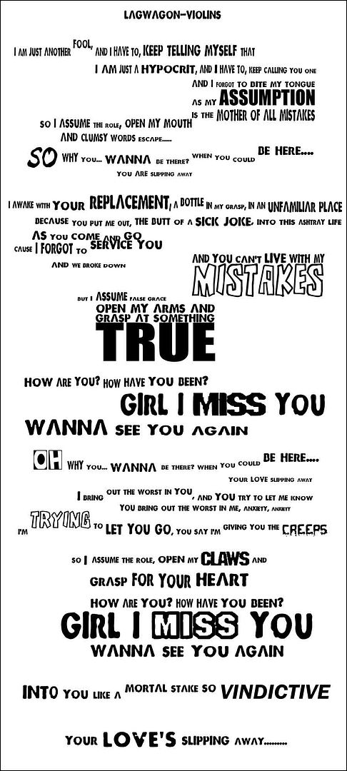
next stop is textappreciation.. learn the value of some words in the context, important words should have a different color, style, font.. something that jumps out, but don't overdo it
(like "true"
)
construction is the key.. typography is the one and only thing some people seem to forget when theyre doing artwork.. your artwork can make or break the artwork