Song - Typography

New Member
★ Black Lounger ★
💻 Oldtimer
Joined
Apr 15, 2003
Messages
4,628
Best answers
0
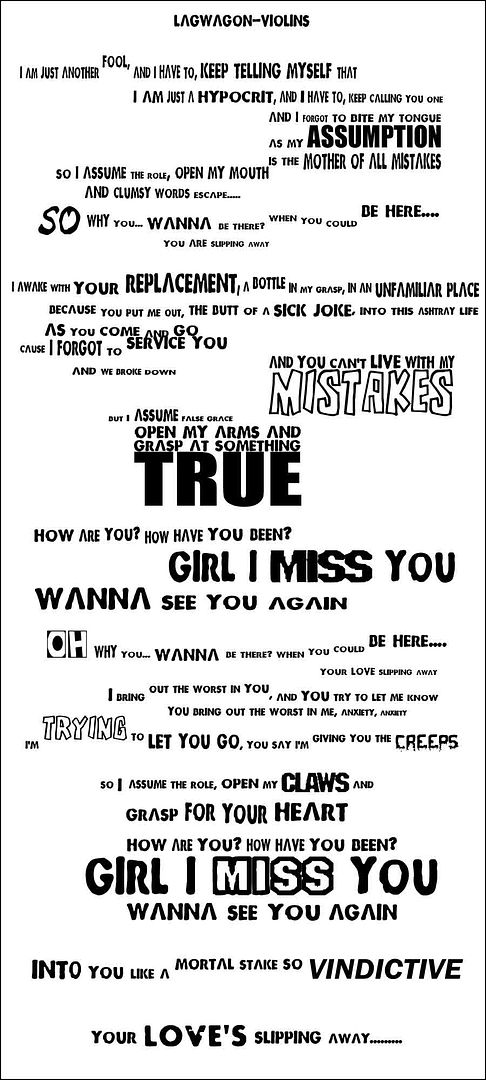
ummmm yeah, has emotional significance at this point in my life, but also would like sum crits. Its all one font, but i want to know if its interesting as it is.... or just plain crap.

OMG >< SORRY, NOT MY SONG ITS BY LAGWAGON called- VIOLINS

here u go bash/crit/tear apart how u like

 
New Member
Joined
Dec 16, 2002
Messages
296
Best answers
0
Very well written. Im sorry if you dont agree with some of the things i have corrected, but i hope you double check them and come to an agreement with what i have said. ;)

You rarely see any acceptable pieces of writing like this anymore, they are always so scattered and vague. Your writing had me sucked in while i was reading it, and i hope i can help make that effect come across even stronger.

Well done :)

 
New Member
💻 Oldtimer
Joined
Nov 5, 2003
Messages
1,049
Best answers
0
INteresting edit Deno, pretty nice david, but if it's gonna be text on a blank it should be a png me thinks, looks low qual
 
New Member
★ Black Lounger ★
💻 Oldtimer
Joined
Apr 15, 2003
Messages
4,628
Best answers
0
eeek me make big mistake, not my song >< not my song, its by Lagwagon, called Violins :( so if u think its anygood then its because of that..... i just wanted to know if the typography was anygood, but thanks for the input it was very informative :]

hmmmm makes me wanna write my own though.... i do love lyrics... i probably suck at them though
 

Bolteh2

B
Guest
allignment mate.. typography may look chaotic, but it still has to have allignment, everything has to be united, ill draw some guidelines in a minute (im at school)

oh, and don't deform the font too much, i can see quite alot of words that have been stretched, the result is a bad balance of the character (thin vertical line and very thick horizontal etc) don't rape fonts too much, respect the balance =p


EDIT:


theres alot more i can tell you about, but these are the main things that came to mind.. next time when you start out, create 1 sentence and start building up from that 1 sentence (allignment blablabla) thats the one thing you should keep in mind when youre playing with typography..

my sig for example: "requiem" is the first word.. "for a" is alligned with the end of requiem.. "dream" is alligned with the topline of "for a"

the line flowing from the baseline of requiem covers the width of the whole textblock, the center of the "}" is alligned with the center of "dream".. etcetc

thats how your mind should work during typography :p

next stop is textappreciation.. learn the value of some words in the context, important words should have a different color, style, font.. something that jumps out, but don't overdo it :) (like "true" :p)


construction is the key.. typography is the one and only thing some people seem to forget when theyre doing artwork.. your artwork can make or break the artwork
 
New Member
★ Black Lounger ★
💻 Oldtimer
Joined
Apr 15, 2003
Messages
4,628
Best answers
0
thanks bolteh, thats just what i needed :], i shall attempt to make it better in a sec, to be honest, i just had to express these words at the time, but now i can see wat u mean with all the alignment >_< i went a bit crazy in places... and this is my first, so yeah, thanks for the great crits, i appreciate them


EDIT

Updated the pic, anybetter?

oh, and any suggestions on how to mess with colour?
 
New Member
Joined
Mar 20, 2004
Messages
886
Best answers
0
Reminds me of something I did once. Its nice, I like it. 2nd edition gets no critz from me.
 
New Member
Joined
Dec 16, 2002
Messages
296
Best answers
0
Oops, my bad.. Didnt know this was based on a song.. There goes my english editing *shrug*

Bolteh: I didnt know there was so much to typography! Very nice edit, i think i'll use some of the effect for some movies im making.. Possibly the credits :eek:

Very well done david, but one last crit.. I think that having all the words (leading up to the first text change "MISTAKES" with the acception of "So") look slightly bland compared to the rest of the writing which changes shape and text kind every couple of cm's.. Looks abit silly to me, but then again thats just me ;)
 

Users who are viewing this thread

Top Bottom