
Old School
💻 Oldtimer
I like this one alot.
a thin black border wouldnt hurt. =]
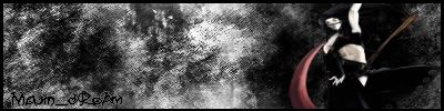
And if youre gonna put a name on it, dont put majin_dream, that joke is so old now. >
a thin black border wouldnt hurt. =]
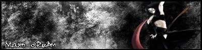
And if youre gonna put a name on it, dont put majin_dream, that joke is so old now. >
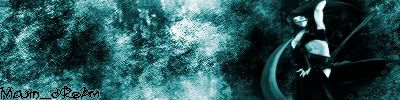
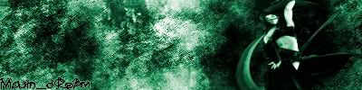
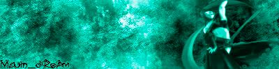
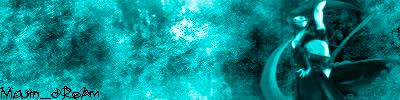
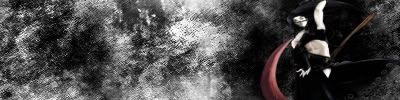
 they look nice, the first one is the best though, although if u made some blending changes with the stock it would look even better (because the picture wasnt great quality, the anime has a slight discolouration) put the contrast up a little on the stock infact, and it'll be real nice.... and yeah add a border, and some nice white grungy font, maybe white with a black pixel thick border I wouldnt use glow, i strongly suggest that you dont align the font on the corner >_> it doesnt look good, leave a nice gap (switch on your grid if u want crtl+shift+" ) the eye is destracted from the flow of the image if u have it at the bottom, because it will automatically drag your eyes off the bottom of the image. Hell if u felt up to it, you could try some nice typography and put it in the middle of the sig, center between the stock and the left edge, it could look pretty spiffy if done right, but only if u feel up to it.
Its looking great, but heh, there's things i'd change (stated above) it has potential
edit: doh i was writing before u edited :x, scince ur edit >_< uve done most of the things i suggested, but i still think white could be a better colour choice than black >_<, but yeah, you have improved the sig quite nicely ^_^
Old School
💻 Oldtimer
Keep this thread on topic, I know youre new so its just a heads up. But to answer your question, yes. Wait for the beta 1.3 release.Buu-whu said:does any1 know if in the ESF if there ganna make like ss2
that u can like become even more powerfuller also is there ganna be a gogeta or veggeto???
if u know plz tell
I would pick another font Dreamkiller, it looks like you used the pencil tool in MSPaint to write it. :]
Users who are viewing this thread
Total: 1 (members: 0, guests: 1)
Share: