
Wogasm Designs
New Member
Retired Forum Staff
💻 Oldtimer
- Joined
- Nov 24, 2001
- Messages
- 1,552
- Best answers
- 0
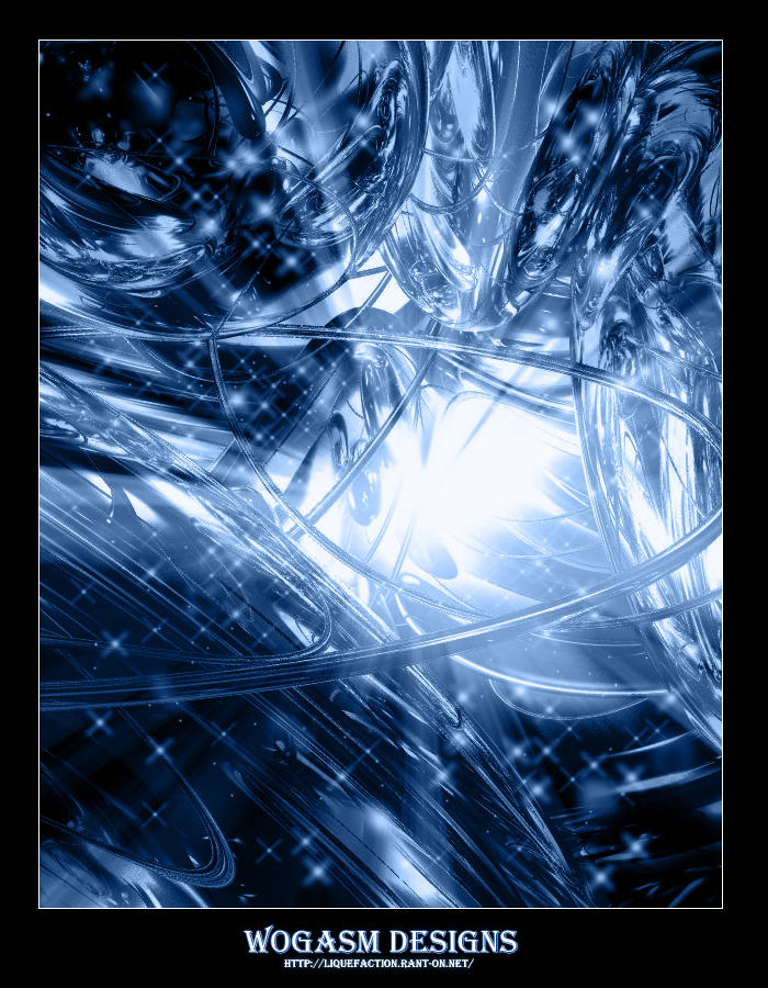
It's pretty nice, but the render doesn't look like it has aa on. You told me it was the quality setting though, so get that set up higher. It does remind me a lot of naz's work, mostly in the bottom left area. That's where the main similarity is, besides of course the 'indy' border...  I like the feel of depth that it gives me. Keep it up!
I like the feel of depth that it gives me. Keep it up!I really don't like that poster look at all. I said it with Naz's stuff, and I say it here. I think it detracts quite a bit from the overall composition. Why chain something you have created in a thick black border? It looks so constrained and uncomfortable in there. I also think you should change your typeface, "Wogasm Designs" looks like a bar name right now. The render is nice, but I have a hard time focusing on it.

Lost in space
💻 Oldtimer
- Joined
- Mar 21, 2002
- Messages
- 1,887
- Best answers
- 0
Yeah, the font doesn't fit the rest of the pic, try other fonts, It might help.
Users who are viewing this thread
Total: 1 (members: 0, guests: 1)
Share: