Signature

New Member
Joined
May 1, 2006
Messages
665
Best answers
0

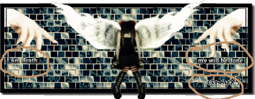
Final version. That is, considering its perfect now.


For credits:
The BG, well its my own. Thank heavens. But I usually overuse my own bgs, after the usual tinkering.

The stock. I seldom see credits for the stock here. Anyway, Since I'm really happy with this piece and wish to use it longer than I have my other signatures, I wanted to thank who made the picture I got this from. Unfortunately, I have no idea. Its been like a year or more since I've had this on my HDD and sadly, never can remember where I get some of my coolest stuff.
Here's what I used anyway. Beautiful picture isn't it?

Border and other stuff are mine. I over use them too.

I suck at choosing fonts. :\

btw. thanks for all the constructive criticism in the "Rate the signature" thread guys. I wanted to get a final rating on what the end product has turned out to be.
The fact that I bothered to type this much shows I really am satisfied. But am up for c&c
 
New Member
💻 Oldtimer
Joined
Sep 11, 2005
Messages
3,746
Best answers
0
It looks fine, but it's not my taste.
 
New Member
Joined
Sep 17, 2007
Messages
21
Best answers
0
awsome please make an 1024x768 and send me an pm ural i wont it for mine desktop!!!
 
New Member
💻 Oldtimer
Joined
Mar 7, 2007
Messages
1,172
Best answers
0
Location
Israel
That mus have been a ***** to cut out. I like it the picture really sends a cool message.

8/10
 
New Member
💻 Oldtimer
Joined
Mar 25, 2002
Messages
1,578
Best answers
0
Location
Estonia, Tallinn
The stock is awesome, but i really dont like the text and the bg on that sig.
 

MC

New Member
💻 Oldtimer
Joined
May 24, 2003
Messages
3,989
Best answers
0
Location
United States, Florida
You sir, are f-ing blind

I barely noticed the text (more specifically the name) myself.

I don't really like the signature though. While everything seems to blend pretty well together (except the font and hands), I don't like the style. The "I am death..." and "my will be done" looks really out of place and your name is difficult to make out. The hands don't really seem to have a point (pun not intended) other than filling empty space. The theme remains a mystery to me.
 
Active Member
✔️ HL Verified
💻 Oldtimer
Joined
Nov 6, 2004
Messages
3,055
Best answers
0
Location
Round Rock, TX
Yeah, I didn't realize there was text for quite some time.
 

Users who are viewing this thread

Top Bottom