Party Poster

New Member
Joined
Dec 16, 2002
Messages
296
Best answers
0
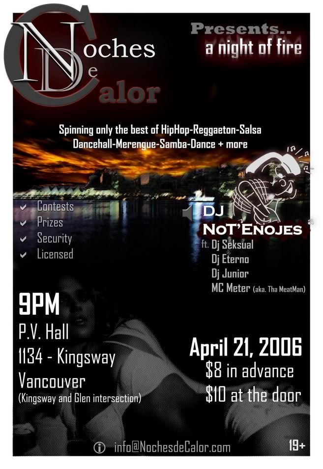
Made a simple and clean cut poster, some mixing of effects and textures on the girl, the city and simple flames to put text into perspective..

Any strong topics of concern before I go print 300 copies of these things for flyers and posters? :)

By the way, artists of Esf, what the hell happened to your creative flair? The threads in here are dissapearing >_<


And yes, I do have time to make alterations.. I much respect the voices of other artists.. Thanks

Deno
 
New Member
Joined
Feb 23, 2006
Messages
515
Best answers
0
No offense, but you lack about everything that there is to lack with typography.. Nothing is aligned, nothing hangs together..

Having a solid layout isn't about slapping different items on some fancy background.. It's about connecting things..
 
New Member
💻 Oldtimer
Joined
Dec 21, 2004
Messages
2,417
Best answers
0
Kimfu said:
No offense, but you lack about everything that there is to lack with typography.. Nothing is aligned, nothing hangs together..

Having a solid layout isn't about slapping different items on some fancy background.. It's about connecting things..
but there is a half naked woman on the front of it...

...whats that to do with music...

...shrugso_o
 
New Member
💻 Oldtimer
Joined
Oct 3, 2004
Messages
1,462
Best answers
0
wow... do I see a 'DJ Seksual' on there? just wow.

The information is too sporatic - I find myself scanning the whole thing just to get essential information

Here's what I think...
Make it so the eye reads all the information RE the subject and then let the eye soak up the effects... prioritize
 
New Member
Joined
Dec 16, 2002
Messages
296
Best answers
0
Actually.. I fixed up afew things with the logo text to make it less bland.. And I went over to print 400 or so of these things.

We already have 100 pre-purchased tickets to a party reserved for 200. Still have 10 days to get more people with tickets beforehand..

Thanks for the advice I guess :p
 
Force Pit Member
Joined
Mar 4, 2004
Messages
294
Best answers
0
Location
December
I think it looks perfectly fine, this isn't a fashion contest, he just needed a poster to advertise for a party. It gets the point across therefore he got the job done.


Good work.
 

L

New Member
💻 Oldtimer
Joined
Mar 31, 2004
Messages
1,069
Best answers
0
Location
B.C, Canada
You live in vancouver aswell or were you just requested to make the poster for that location?
I'd go but the poster says "19+" D:
Kudos on the poster.
 

Users who are viewing this thread

Top Bottom