

Active Member
💻 Oldtimer
- Joined
- Nov 18, 2002
- Messages
- 4,201
- Best answers
- 0
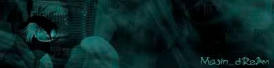
A border need at the end... Font is boring....a wierd thingy near kakashi... bad background...kakashi is bad blended...kakashi is to often used by u....
6-10/10 = 4/10 :no:
But anyway...ur learning ^^ its a good training for you...
Look at the artwork section at the stickys! Sicron have posted many sites with brushes! Try to use some brushes! and find a kewl style ^^ Go up :yes:
6-10/10 = 4/10 :no:
But anyway...ur learning ^^ its a good training for you...
Look at the artwork section at the stickys! Sicron have posted many sites with brushes! Try to use some brushes! and find a kewl style ^^ Go up :yes:
Active Member
✔️ HL Verified
💻 Oldtimer
Not bad. Doesn't look like you put alot of effort into it. I personally think you could have done a better job. It's not bad though. 6/10

Users who are viewing this thread
Total: 1 (members: 0, guests: 1)
Share: