New Member
✔️ HL Verified
💻 Oldtimer
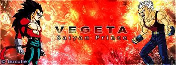
They all seem to miss borders. The first one has hard to read fonts. I love the second one and the last one...the red is too saturated and the pictures are way to low quality.
New Member
💻 Oldtimer
8/10
9/10
4/10 I really dont like that vegeta sig -.- The colors make me wanna hurl.
9/10
4/10 I really dont like that vegeta sig -.- The colors make me wanna hurl.
New Member
💻 Oldtimer
- Joined
- Dec 21, 2004
- Messages
- 2,417
- Best answers
- 0
buculie said:here are my ultimate sigs
1.Sub-Zero

2.Iron Man :fight: :fight: :fight:

3.Vegeta

rate , crit & comment plss
i lost that tutorial, the iron man one :O
i like em all, the iron man ones kind of bland, the 3rd ones got some nice contrast to it, but maybe you should just dark the red area.. or brush over it or something.
sub zero one is neat
pixel border ftw
New Member
💻 Oldtimer
- Joined
- Dec 21, 2004
- Messages
- 2,417
- Best answers
- 0
that last ones really cool.
New Member
💻 Oldtimer
I like the tien sig out of the rest.
1.7/10
2.7/10
3.4/10
4.8/10
1.7/10
2.7/10
3.4/10
4.8/10
Users who are viewing this thread
Total: 1 (members: 0, guests: 1)
Share:

