
Lost in space
💻 Oldtimer
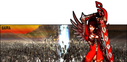
U shouldve make that white part transparent. or Use this forum's color.
its a .png so if ur using firefox it comes up as transparent, if ur using IE it comes up as white because it doesnt support it. I could of made it the forum colour to go with any internet but I took the lazy wayU shouldve make that white part transparent. or Use this forum's color.
and ill change it abit later with the suggestion, need to go out soon :/
EDIT:
suggestion 1:
suggestion 2:

Lost in space
💻 Oldtimer
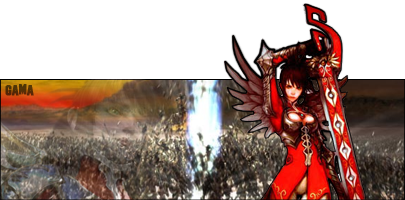
The filterd one is awesome. Just increase the opacity of the girl on the left by 5 to 10

Active Member
✔️ HL Verified
💻 Oldtimer
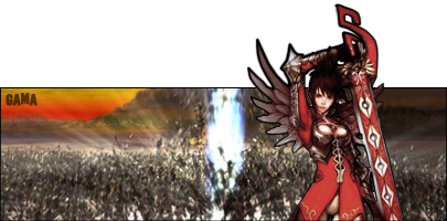
Definately that one. 8/10 because it's simple, yet oh so sexy.
Users who are viewing this thread
Total: 1 (members: 0, guests: 1)
Share: