
New Member
- Joined
- Jan 2, 2006
- Messages
- 73
- Best answers
- 0
IMO i think that last one is the best cuz its got Illidan in it.
Lost in space
💻 Oldtimer
- Joined
- Sep 20, 2003
- Messages
- 3,211
- Best answers
- 0
1. Left side is good, right side looks busy. Font works (could be better) Color is terrible.Kenny83 said:Tell me what you think needs work, and what I can do to improve it (as well as instructions as to how to do it 'cause I am a nub) please. **Note: I know they are huge, they are for looks more than using.
1.
2.
3.
4.
5.
2. Awsome stock. Looks great. The sig itself could use some work. Looks blotchy and unorganized. You could probably make it flow better. Other than that it's my favorite so far.
3. Terrible terrible sig, sorry. If you're going to make people stick out, make sure you get all of them so you don't know where the sig ends. In other words, he needs feet. Also, one side is read the other is black and white. That's a no on. Make it consistent. You can change colors from one side of the sig to the other. But make it transition. In this case, it would look better if the other side of the sig (black and white side) was red as well. The Kenny font works. But it doesn't work for the words.
4. Take the text out, and move the font next to the sythe and you have yourself a deal
") (though like i said with the previous on, if you're going to make it stick out, make everything stick out, feet, hands, everything. Never cut off the stock in the sig if it sticks out, never.
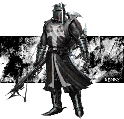
(though like i said with the previous on, if you're going to make it stick out, make everything stick out, feet, hands, everything. Never cut off the stock in the sig if it sticks out, never.5. Bad stock, i can't tell what it is. It's too dark. Never put text on the stock. It makes it look horrible.
Hope this helped.
Thanks a lot guys. Fire Phoenix did what I was looking for. No matter how good or bad the sig is, I need to know, and how to fix it. I don't take this personally, so be as harsh as you will.
As for making people stick out, I just sorta realized that after I posted, I will work on these some more when I have the time.
Thanks all!
As for making people stick out, I just sorta realized that after I posted, I will work on these some more when I have the time.
Thanks all!
Users who are viewing this thread
Total: 1 (members: 0, guests: 1)
Share: