
New Member
✔️ HL Verified
💻 Oldtimer
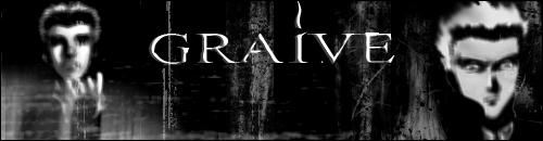
images blurry, crappy font, 5 grungebrushes rest is a normal black background, no color (if you want something to be "dark" first throw on a color balance layer and pick a nice color, then throw a gaussian 2,0 blur on top of it go to edit>fade gaussian blur and use the multiply blending mode for a "dark" sig)
i give it....a 2/10
i give it....a 2/10
New Member
- Joined
- Mar 1, 2004
- Messages
- 451
- Best answers
- 0
much to learn, you still have.
lol.
u gotta stop using bevel+emboss on your texts dude...
lol.
u gotta stop using bevel+emboss on your texts dude...
New Member
✔️ HL Verified
💻 Oldtimer
brushing isnt hard at all...you just need to try it...here ill tell you how to brush something, i know its the basics...but heh it works >.>
1)Start a layer, use the cloud filter (for better effects)
2)Create a new layer, take 1 brush, tap a few times at different places, set blending mode to soft light (use foreground color black)
3) do this about 4-5 times with different brushes each time
4) take a new brush set your foreground color to white, brush a few times, set blending mode to softlight
5) use color balance (adjustments menu) to pick a color
6) new layer, ctrl+a, edit>stroke> 1 px border
7) add any other crap and you have yourself a sig =D
this is one basic style of brushing, using different brushes, styles/blending modes and SOMETIMES a filter (filters mostly suck, but you need to use the cloud filter in this style or else you get a really weird half transparant background....unless you use a basic black or white background...but thats crap >.<)
New Member
- Joined
- Mar 13, 2005
- Messages
- 223
- Best answers
- 0
hazzah! i shall try this as i have the psd file saved or whatever so i can still mess with layers and stuff
UPDATE:
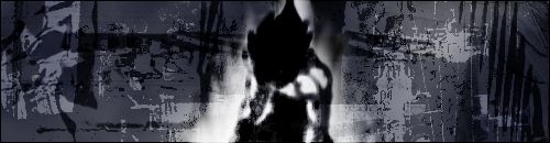
i basicly started again, i took your advice sicron and this is what i have now
i think its a massive inprovement anymore ideas would be nice
UPDATE:
i basicly started again, i took your advice sicron and this is what i have now
i think its a massive inprovement anymore ideas would be nice
Lost in space
💻 Oldtimer
- Joined
- Dec 21, 2003
- Messages
- 3,608
- Best answers
- 0
i like it , i just think the tones should just be adjusted a little and some light sources changed
a 7.5/10 from me
2nd one 6/10
a 7.5/10 from me
2nd one 6/10
New Member
✔️ HL Verified
💻 Oldtimer
you need new grunge brushes, i can see you didnt use a cloud filter, but just a normal black background which makes the brushes easy to see...and doesnt look nice, it is an improvement, but it can still use some more, picture is too blurred and low quality...you sig also lacks color...i mean, a sig doesnt have to be black and white to be "dark"
Ice Cream God
✔️ HL Verified
- Joined
- Dec 2, 2001
- Messages
- 950
- Best answers
- 0
Both sigs look boring. On the second one i say take out the stuff behind that figure in the middle. Maybe then the BG will stand out more.
Users who are viewing this thread
Total: 1 (members: 0, guests: 1)
Share: