bad guy concept... redone

New Member
★ Black Lounger ★
💻 Oldtimer
Joined
Apr 15, 2003
Messages
4,628
Best answers
0
bad guy concept... redone UPDATED

Tryin out my brushpen, havent used it in a while... it really sucks not havin a tablet :( i miss it, anyways, this is a redesign of my desert sun badguy, he's called Brendan. Hopefully now he looks a bit more evil and scary, and i buffed him up a bit, i know about his hand being a lil big, but on my pencils it didnt look that bad, and wen i inked it..... well u cant rub out ink.
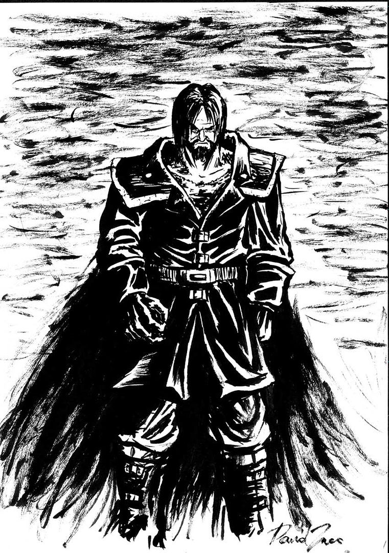


C&c aprieciated

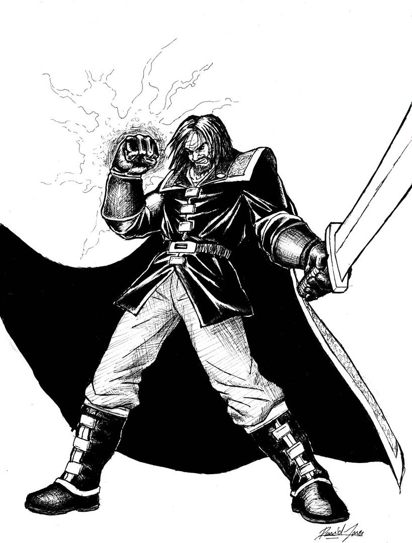
Another of him:
 
Super Moderator
💻 Oldtimer
Joined
Dec 1, 2001
Messages
3,125
Best answers
0
Saweeeeet. Love that effect! He definately has that "bad guy" feel to him. And I know I ask this everytime you make an art thread but... You gonna CG it? =D
 
New Member
★ Black Lounger ★
💻 Oldtimer
Joined
Apr 15, 2003
Messages
4,628
Best answers
0
no, unfortately i got no time :( but if any 1 wants to try, they're welcome to
 
New Member
💻 Oldtimer
Joined
Jun 30, 2003
Messages
2,327
Best answers
0
Hehe reminds me of the current undertaker from WWE

But it's pwnage man. He looks evil and as if he possess great vows of destruction.

Like i said before, i love you originality.
 
New Member
💻 Oldtimer
Joined
Aug 21, 2004
Messages
1,738
Best answers
0
haha holly crap, your right, it does look like the undertaker!! so i guess that means u achived the evil feel to it lol, great work
 
Member
Joined
Aug 22, 2004
Messages
183
Best answers
0
looks nice.. nice inkin ya? hehe the hands seem a bit big.. but i love it when people exaggerate the hands.. keep it up lovely triangular composition ;) keep it coming
 
New Member
Joined
May 30, 2003
Messages
842
Best answers
0
Love it. Give him a kickass sword or something.
Swords rule.
 
New Member
💻 Oldtimer
Joined
Dec 7, 2002
Messages
2,275
Best answers
0
:O!! that is really well done! when i see him, i always thinks shang tsung from mortal combat: deadly alliance, which is good, still, what colours would suit hims...


red+black works for me, my only crit would be a huge blade in that left hand, it seems too good of a place to place a weapon of some kind to leave it, just a big ass nasty sword with the blade going to the left beind his cloak would work :eek:
 
New Member
★ Black Lounger ★
💻 Oldtimer
Joined
Apr 15, 2003
Messages
4,628
Best answers
0
nice colours shijing, i quite like the moon there :], i already know wat colours are needed, and red and black is definately in consideration though...... And i think he will have some sort of meat cleaver, a huge sword will do... just im not good at weapon design, i'll see wat i can come up with

well here he is, good old ink, and it took sum time, i cudnt be bothered to detail the cloak so enjoy :)

 
New Member
💻 Oldtimer
Joined
Mar 21, 2003
Messages
1,207
Best answers
0
woah! i love them! you showed the last 1 to meh last night, it was awesome to c it in drunk state, i wub it man.. BUT .... i like ur first one better :p it really roxxx the black and white color use and placement fits so good, the second one also rox, but imo the hands are a little to big, even dough 1 of em comes forward, his fist is already as big as his head, it should be the hand spread that is that big, but it does look cool, but it isnt really correct.

GJ m8, one of ur best ones so far.
 
New Member
💻 Oldtimer
Joined
Jun 30, 2003
Messages
2,327
Best answers
0
HOLY GEEBERZ the second one just creamed me.

I like it and his whole facial expression as if he's doing a desperation attempt to take out his enemy. ^_^
 

jp

New Member
💻 Oldtimer
Joined
Aug 23, 2003
Messages
1,561
Best answers
0
Those drawings are perfect!

That is a reall evil bad guy!
 
New Member
★ Black Lounger ★
💻 Oldtimer
Joined
Apr 15, 2003
Messages
4,628
Best answers
0
thanks for the encouragement, i just feel i should be tryin to get better before i start, cuz if i make it as good as i can, it will be sumthin to show any publishing companies so i can get a job in the buisness, or it'll jus improve my skill so i will be more likely to get work. I still have problems while drawing and they arent perfect i have a long way to go before im that good. I hope to improve though ><
 
Retired
Joined
Nov 24, 2001
Messages
0
Best answers
0
somehow he looks more like a bad 'hero'. like a cool guy who has this bad vibe over him. only he actually is a hero. know what I mean? ;)

anyway nicely done. the only comments I have are about his clothes rather than the drawing style. since that's very good imo.

good job

(ah and the clothes comment would be: I would make him stylish as in a long coat that's more 'attached' to his body rather than a leather coat that flails about if you know what I mean. a bit matrix or equilibrium style maybe, just love those coats ;))
 
brainfeeder
💻 Oldtimer
Joined
May 29, 2002
Messages
5,179
Best answers
0
Location
Florida
Hmm, It looks great overall... but I honestly don't like the fact his hands are twice the size of his head.

Just a crit, your an awesome artist.
 
New Member
★ Black Lounger ★
💻 Oldtimer
Joined
Apr 15, 2003
Messages
4,628
Best answers
0
yus judge i know what mean, i made a misate on the eyes >< made em a little to bright, and his trousers arent crosshatched enough (too bright) but im not gonna mess with it atm. and yeah his hands are too big again >< doh but it shudnt be that way in the comic :) i think its just the head is slightly too small and the hands in this pic are slightly large, im gonna be practicing a lot more :).

I feel inspired recently, so many good artists have started posting, and a lot of drawers, makes me feel inspired :D, i must thank them really, im terribly appathetic but wen i see good work being produced i cant help but wanna improve ><. Anyways thankies to u artists that are inspiring :) its good to have u around
 
Member
Joined
Aug 22, 2004
Messages
183
Best answers
0
i like the pose of the second one! the feet are really good hehe.. keep it up
 

Users who are viewing this thread

Top Bottom