Synth brainfeeder 💻 Oldtimer Joined May 29, 2002 Messages 5,179 Best answers 0 Location Florida Jan 26, 2008 #2 First sig has weird pixelations at the bottom. Second sig rocks... just smudge some of the glare.
Ice_Dragon I New Member Joined Jul 27, 2004 Messages 56 Best answers 0 Jan 26, 2008 #3 Those pixelations are supposed to be there. They're clipping masks. That glare is the lighting on the sig. It looks much worse without it.
Those pixelations are supposed to be there. They're clipping masks. That glare is the lighting on the sig. It looks much worse without it.
Adaptus New Member 💻 Oldtimer Joined Apr 14, 2005 Messages 4,022 Best answers 0 Jan 26, 2008 #4 I think the second sig is freaking sweet, I'd definitely use it. O: Hint hinit.
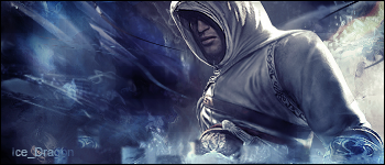
Jakut New Member 💻 Oldtimer Joined Mar 25, 2002 Messages 1,578 Best answers 0 Location Estonia, Tallinn Jan 26, 2008 #5 I think that you can still make the second sig better by highlighting the middle (or maybe all) of his eyes.
I think that you can still make the second sig better by highlighting the middle (or maybe all) of his eyes.
MF29 M New Member 💻 Oldtimer Joined Sep 11, 2005 Messages 3,746 Best answers 0 Jan 27, 2008 #6 The middle signature is spectacular and it is so spectacular that I can't believe that the other was posted, it blows the others out of the water.
The middle signature is spectacular and it is so spectacular that I can't believe that the other was posted, it blows the others out of the water.