
The BIATCHFORMERS :D^^
- Thread starter Zabuza2k
- Start date
-
- Tags
- biatchformers
Out of the 3, i like the first one best.
They both have good effects, but the color scheme is not good at all. They're also too big for my taste.
Maybe crop them a little, change the colors to more brighter and colorful, thus keeping the brown color.
They both have good effects, but the color scheme is not good at all. They're also too big for my taste.
Maybe crop them a little, change the colors to more brighter and colorful, thus keeping the brown color.
Lost in space
💻 Oldtimer
me likes second one
New Member
- Joined
- Nov 2, 2006
- Messages
- 109
- Best answers
- 0
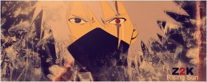
I like the 1st one. Coz, Kakashi is teh smecksiness! 
Active Member
✔️ HL Verified
💻 Oldtimer
They've got a good style to them, but I don't like that color. I can't explain why, but it makes me sick. I've never been fond of copper-colored sigs. 6/10
Oh, and the text on the third one is greyed out in the middle. Might wanna fix that. 7/10 for the third because it's B&W.
Oh, and the text on the third one is greyed out in the middle. Might wanna fix that. 7/10 for the third because it's B&W.
New Member
💻 Oldtimer
Try making the head colorful, like it coming alive or something, can't really explain my concept.
Users who are viewing this thread
Total: 1 (members: 0, guests: 1)
Share: