
New Member
✔️ HL Verified
💻 Oldtimer
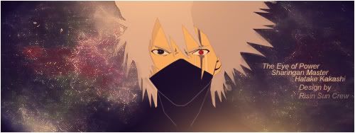
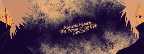
Redo those sigs, same style, same images but then on a 350x90 field and you might have a winner, these signatures are just way too big and that is what kinda ruins them. Also don't put too much text in it, one name (Hatake Kakashi, or Zabuzak2k should be more than enough)

New Member
✔️ HL Verified
💻 Oldtimer
Yes, this looks much better! You could reduce the height a bit more, but it's not necessary. Font looks fine in this size IMO. But as Barney said, it does need a 1 pixel black border to finish it. Other than that, it looks really nice.
Users who are viewing this thread
Total: 1 (members: 0, guests: 1)
Share: