haven't posted here in a while..

New Member
Joined
Dec 1, 2004
Messages
245
Best answers
0


Just wondering what you guys think. I know alot of you around here are really improving :p
 
New Member
💻 Oldtimer
Joined
Mar 25, 2002
Messages
1,578
Best answers
0
Location
Estonia, Tallinn
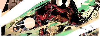
You really should work on your newfound style. There are far too many visible blocky pixels, try either bluring them out or to make them sharper somehow and is that a magnetic(polygon) lasso i see?
 
New Member
💻 Oldtimer
Joined
Aug 27, 2006
Messages
1,285
Best answers
0
Location
Finland
It looks too sharp. Could you try to put those green 'lines' away or atleast replace with red? I'd like to see how it'd look like that.
 
New Member
✔️ HL Verified
💻 Oldtimer
Joined
Mar 29, 2003
Messages
4,765
Best answers
0
Location
The Netherlands
Get rid of the pen-tool lines, and you're winner! They kinda disrupt the flow of the sig IMO.
 
New Member
Joined
Apr 23, 2005
Messages
890
Best answers
0
Try using the same colour sceme that the render has and whats with the pen tool lines? I've never really been a fan of this style though, too abstract...
 
New Member
✔️ HL Verified
💻 Oldtimer
Joined
Mar 29, 2003
Messages
4,765
Best answers
0
Location
The Netherlands
I think the pen tool is a part of his style, He also did it before with a Magic Lasoo, just took a screenshot of it. Not many people are a fan of it though, it just looks misplaced.
 
New Member
Joined
Aug 18, 2002
Messages
321
Best answers
0
I think it's got too much going on in it for my taste. But then again, I shouldn't talk. I'm about as simple as it gets with signatures.
 
New Member
💻 Oldtimer
Joined
Sep 11, 2005
Messages
3,746
Best answers
0
The render is wrong, the focal color is red which throws everything off, the effects are nice but if the render color matched everything else, the signature would be fine.
 
New Member
💻 Oldtimer
Joined
May 13, 2003
Messages
2,904
Best answers
0
Agreed. There's too many colours in there. The effects on their own and the composition are good, just get rid of the colours.
 
New Member
💻 Oldtimer
Joined
Sep 11, 2005
Messages
3,746
Best answers
0
Change the purple to a color from the render.

Or at least change that pen tool shape to a clipping mask, then blur the surrounding effects and background to add depth.
 
New Member
✔️ HL Verified
💻 Oldtimer
Joined
Mar 29, 2003
Messages
4,765
Best answers
0
Location
The Netherlands
The purple/pink clashes with the rest of the signature, personally, I would change those parts to a color in the range of #f5eda3. But that's just my opinion.
 

Users who are viewing this thread

Top Bottom