My shot at a Spawn sig. o_o

New Member
💻 Oldtimer
Joined
May 13, 2003
Messages
2,904
Best answers
0
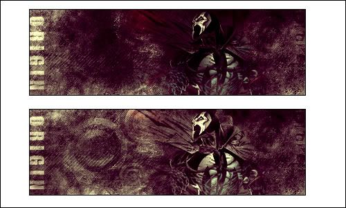
Yeah I wanted to work on a sig some more but couldn't think of a stock to use... then I came across the Spawn thread and figured Spawn is a kickass character to use.. so yeah. Here it is.


I.. kinda like it.. myself. o_o
 
brainfeeder
💻 Oldtimer
Joined
May 29, 2002
Messages
5,179
Best answers
0
Location
Florida
I like the color scheme... it's just missing something, dunno what though.
 
Cunning as Zeus
Banned
✔️ HL Verified
💻 Oldtimer
Joined
Nov 23, 2003
Messages
6,079
Best answers
0
That's ****ing amazing. I think it might be better if he stood out a bit more, cause I had to kinda get up close to see his cape (blends into the background), but that is amazing.

And he isn't even doing a kame.

@ Synth: I think that space on the left-hand side of the sig might be bothering you. Lots of open space.
 
New Member
💻 Oldtimer
Joined
May 13, 2003
Messages
2,904
Best answers
0
Thanks for the comments. :)

And yeah, I had to tone down the colors on Spawny himself a bit because he was like this ugly blob on top of my pretty background :p Used some brushing and some erasing to make his cape "disappear", sort of speak. :p

And Synth.. figure out what it's missing and get back to me -.-
 
New Member
💻 Oldtimer
Joined
May 13, 2003
Messages
2,904
Best answers
0
Yeah you see.. I tried cropping it but it came out looking really weird. It's probably because of Spawn's pose and the direction he's looking in. Now I agree the left side may be a bit too empty, but there's nothing to fill the room up with. And too blended? Personally I don't like it when my stocks are thrown onto a sig...I try to make it look as much as one piece as possible.

Thanks for the comments. :)
 
New Member
💻 Oldtimer
Joined
Sep 11, 2005
Messages
3,746
Best answers
0
Good, but the signature has some negative space, and it seems empty.
 
New Member
💻 Oldtimer
Joined
Mar 25, 2002
Messages
1,578
Best answers
0
Location
Estonia, Tallinn
Well making a sig into a "Find Waldo" game isn't quite good either, try inserting a different spawn, a bulkier one.
 
New Member
💻 Oldtimer
Joined
May 13, 2003
Messages
2,904
Best answers
0
Alright... is this better?


Crap. Border went missing. >_>
 
brainfeeder
💻 Oldtimer
Joined
May 29, 2002
Messages
5,179
Best answers
0
Location
Florida
I dunno... rather than trying to downsize the sig, try to add some of the similar brushing over the bare spot, or throw in a low opacity image that matches the main one.
 
New Member
💻 Oldtimer
Joined
May 13, 2003
Messages
2,904
Best answers
0
While keeping this size? Or should I go back to the original size?
 
New Member
💻 Oldtimer
Joined
May 13, 2003
Messages
2,904
Best answers
0
Alright.. tried it.


And a comparison between the original and this one to point out the differences;

 
New Member
💻 Oldtimer
Joined
May 13, 2003
Messages
2,904
Best answers
0
Woo yay!

Thanks for the crits and comments everyone, very much appreciated! I hope everyone can keep this level of enthusiasm up for as long as possible. :)
 

Users who are viewing this thread

Top Bottom