

New Member
✔️ HL Verified
💻 Oldtimer
STARTING POINTS: 5
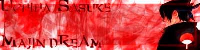
What is needed?
-A black border -1
-Pic Blending -1
What is ok?
-Background +3
What is NOT ok?
-Picture (low quality) -2
-Font -0.5
TOTAL: 4,5
What is needed?
-A black border -1
-Pic Blending -1
What is ok?
-Background +3
What is NOT ok?
-Picture (low quality) -2
-Font -0.5
TOTAL: 4,5
Lost in space
💻 Oldtimer
- Joined
- Sep 20, 2003
- Messages
- 3,211
- Best answers
- 0
I like it. Change the text and your golden. And maybe a better picture. It's not working with that bg.
New Member
✔️ HL Verified
💻 Oldtimer
well it looks better already, but the sig needs a border on the outside, else it doesnt "blend/end" well with the forum BG, second, the text really needs a different font...it just doesnt fits...third...the text should not thouch the (outer/ending) border of the sig....just looks dumb X-x
TeeHee
Banned
Ouch. Text hurts dude. X_X
Users who are viewing this thread
Total: 1 (members: 0, guests: 1)
Share: